-
Bug
-
Resolution: Unresolved
-
 Minor
Minor
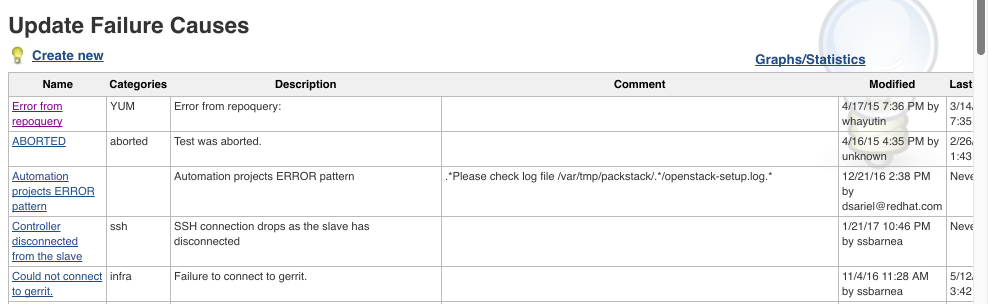
This bugs covers two very closed issues
- On list of listing page: The columns are taking too much space, at least description and comment should be on the same column (if not even name).
- On the edit page: the purpose of Name, Description and Comment are not explained at all, being confusing even for power people that are using BFA often. We need to find a way to tell people what is the purpose and use of these fields. That they are supposed to put inside.
Proposed solution:
- Add Description and Comment to the Name column, with newlines and prefix "Description: <br>". This should make a better use of the screen real estate.
- No idea regarding improvement for "edit screen", awaiting feedback.