-
Improvement
-
Resolution: Unresolved
-
 Major
Major
-
Jenkins ver. 2.204.2
Warnings Next Generation Plugin 7.3.0
The current page readability can be enhanced by adding and changing a bit the current layout and detailed presented.
2) Below the header - add textual summery which includes aggregation of the information presented in the graph similar to the cppcheck plugin table or add it as another presentation available for the graph.
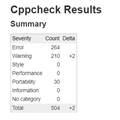
- The table above includes the number of warning for each severity.
Yes, it is true that this information is presented in the graph and you can see the numbers once you hover the chart, but it is also valuable to have it in table. (Maybe the chart can have two modes, textual and graph) - Moreover presenting the numerical delta from last build is very helpful
- The same applies to the reference comparison graph

- relates to
-
-
- Closed
-
[JENKINS-61333] Show severities and trend in table
| Description |
Original:
The current page readability can be enhanced by adding and changing a bit the current layout and detailed presented. 1) Add job information to the Page Header On top of the tables it would be helpful to add the job details as in the Job status page (job name and *time*). 2) Below the header - add textual summery which includes aggregation of the information presented in the graph similar to the cppcheck plugin table or add it as another presentation available for the graph. !cpp_table.jpg! * The table above includes the number of warning for each severity. Yes, it is true that this information is presented in the graph and you can see the numbers once you hover the chart, but it is also valuable to have it in table. (Maybe the chart can have two modes, textual and graph) * Moreover presenting the numerical delta from last build is very helpful * The same applies to the reference comparison graph * At a lower priority also adding the aggregate information of the details table e.g. number of files with warning, number of types, number of authors. * It would be very nice if the textual number can be a link to the more detailed view e.g. clicking on the number of new issues will expand to the new issues list. Clicking on the number of types will expand to the current types list (that is expandable today to the actual message of this type) 3) Clicking the graph (or the table) on the top of the page will not change only the graph but also the will act as a filter to the details table. e.g. if the chart shows only new issues - the details table should show only new issues as well |
New:
The current page readability can be enhanced by adding and changing a bit the current layout and detailed presented. 2) Below the header - add textual summery which includes aggregation of the information presented in the graph similar to the cppcheck plugin table or add it as another presentation available for the graph. !cpp_table.jpg! * The table above includes the number of warning for each severity. Yes, it is true that this information is presented in the graph and you can see the numbers once you hover the chart, but it is also valuable to have it in table. (Maybe the chart can have two modes, textual and graph) * Moreover presenting the numerical delta from last build is very helpful * The same applies to the reference comparison graph * At a lower priority also adding the aggregate information of the details table e.g. number of files with warning, number of types, number of authors. * It would be very nice if the textual number can be a link to the more detailed view e.g. clicking on the number of new issues will expand to the new issues list. Clicking on the number of types will expand to the current types list (that is expandable today to the actual message of this type) |
| Summary | Original: CLONE - Add more details and query capabilities to the page: A summary table (+delta) & job details | New: Pull distribution tables out of tabs |
| Link |
New:
This issue relates to |
| Summary | Original: Pull distribution tables out of tabs | New: Show severities and trend in table |
| Labels | Original: user-experience | New: UX user-experience |
| Description |
Original:
The current page readability can be enhanced by adding and changing a bit the current layout and detailed presented. 2) Below the header - add textual summery which includes aggregation of the information presented in the graph similar to the cppcheck plugin table or add it as another presentation available for the graph. !cpp_table.jpg! * The table above includes the number of warning for each severity. Yes, it is true that this information is presented in the graph and you can see the numbers once you hover the chart, but it is also valuable to have it in table. (Maybe the chart can have two modes, textual and graph) * Moreover presenting the numerical delta from last build is very helpful * The same applies to the reference comparison graph * At a lower priority also adding the aggregate information of the details table e.g. number of files with warning, number of types, number of authors. * It would be very nice if the textual number can be a link to the more detailed view e.g. clicking on the number of new issues will expand to the new issues list. Clicking on the number of types will expand to the current types list (that is expandable today to the actual message of this type) |
New:
The current page readability can be enhanced by adding and changing a bit the current layout and detailed presented. 2) Below the header - add textual summery which includes aggregation of the information presented in the graph similar to the cppcheck plugin table or add it as another presentation available for the graph. !cpp_table.jpg! * The table above includes the number of warning for each severity. Yes, it is true that this information is presented in the graph and you can see the numbers once you hover the chart, but it is also valuable to have it in table. (Maybe the chart can have two modes, textual and graph) * Moreover presenting the numerical delta from last build is very helpful * The same applies to the reference comparison graph |
| Assignee | Original: Ulli Hafner [ drulli ] | |
| Labels | Original: UX user-experience | New: UX help-wanted user-experience |
| Labels | Original: UX help-wanted user-experience | New: help-wanted user-experience |
| Labels | Original: help-wanted user-experience | New: help-wanted newbie-friendly user-experience |
| Labels | Original: help-wanted newbie-friendly user-experience | New: help-wanted newbie-friendly ux |