-
 Epic
Epic
-
Resolution: Unresolved
-
 Major
Major
-
Accessibility-Config-UI-tables-to-div
-
We would like to make Jenkins usable by as many people as possible. It includes multiple groups of users: people with disabilities, ones using mobile devices, or those with slow network connections. In general, all Jenkins users would benefit from better navigation and layouts. Currently the Jenkins's UI includes a lot of tables on configuration pages. These tables are very mobile hostile. The UI is also not in line with modern UIs.
Testing
- Quick-start: https://github.com/oleg-nenashev/jenkins-tabs-to-divs-config-migration-testenv
- Manual setup: docker run --rm -ti -p 8080:8080 -e ID=3895 jenkins/core-pr-tester
Examples
Here's one example from Windows 10's settings:
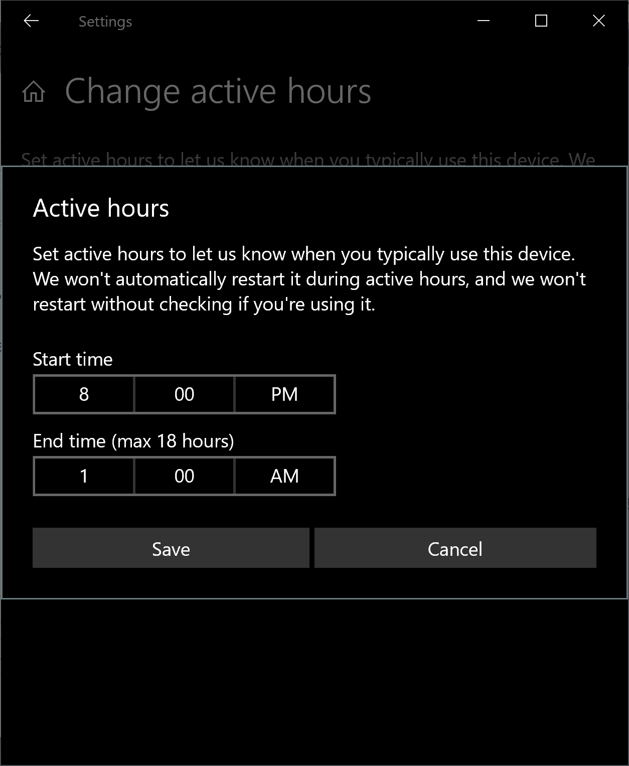
Note that the label for a field is above the field – not to the left of the field.
Here's a much older UI from Windows:
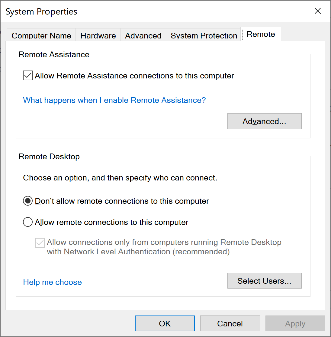
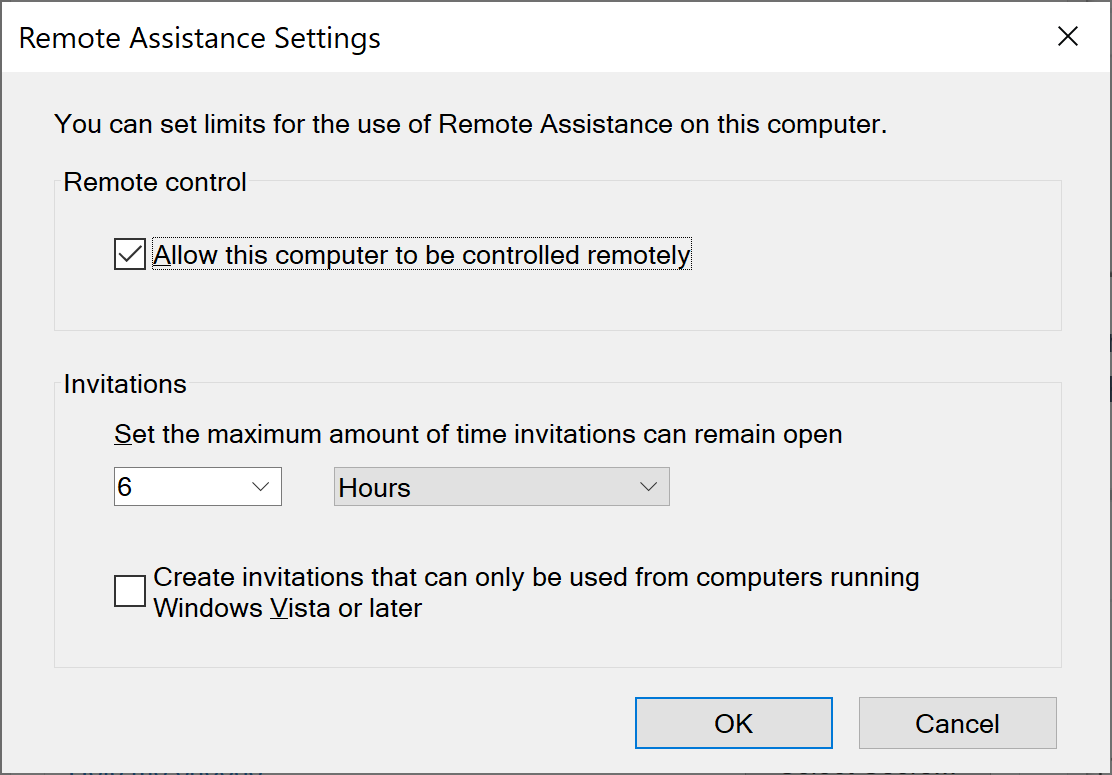
Note that the labels for checkboxes/radios are to the right of the buttons, not to their left (* with RTL layouts, this changes, but that's due to mirroring and applies to almost everything). Even so, labels for other things are above, not to their left (see this example for invitation duration – which is also pre Windows 10):


- relates to
-
JENKINS-55787
Switch labels from entry to checkbox
-

- In Progress
-
[JENKINS-62437] Change Jenkins configuration UI from tables to divs
| Link | New: This issue relates to JENKINS-55787 [ JENKINS-55787 ] |
| Assignee | Original: Josh Soref [ jsoref ] |
| Summary | Original: CLONE - Change Jenkins configuration UI from tables to divs | New: Change Jenkins configuration UI from tables to divs |
| Labels | Original: accessibility ux ux-sig | New: accessibility roadmap ux ux-sig |
| Issue Type | Original: Story [ 10002 ] | New: Epic [ 10001 ] |
| Epic Name | New: Accessibility-Config-UI-tables-to-div |
| Description |
Original:
Currently jenkins's jelly framework generates lots of tables. These tables are very mobile hostile. The ui it generates is also not in line with modern UIs. Here's one example from Windows 10's settings: !image-2019-02-12-15-44-44-739.png! Note that the label for a field is above the field – not to the left of the field. Here's a much older UI from Windows: !image-2019-02-12-15-45-51-351.png! Note that the labels for checkboxes/radios are to the right of the buttons, not to their left (* with RTL layouts, this changes, but that's due to mirroring and applies to almost everything). Even so, labels for other things are above, not to their left (see this example for invitation duration – which is also pre Windows 10): !image-2019-02-12-15-46-51-006.png! I can provide examples from macOS, Maemo/MeeGo, and pretty much every system (including Chrome/Firefox/Android). I happen to be using a Windows 10 laptop today (snow day), but normally I use macOS / Android. |
New:
We would like to make Jenkins usable by as many people as possible. It includes multiple groups of users: people with disabilities, ones using mobile devices, or those with slow network connections. In general, all Jenkins users would benefit from better navigation and layouts. Currently jenkins's jelly framework generates lots of tables. These tables are very mobile hostile. The ui it generates is also not in line with modern UIs. Here's one example from Windows 10's settings: !image-2019-02-12-15-44-44-739.png! Note that the label for a field is above the field – not to the left of the field. Here's a much older UI from Windows: !image-2019-02-12-15-45-51-351.png! Note that the labels for checkboxes/radios are to the right of the buttons, not to their left (* with RTL layouts, this changes, but that's due to mirroring and applies to almost everything). Even so, labels for other things are above, not to their left (see this example for invitation duration – which is also pre Windows 10): !image-2019-02-12-15-46-51-006.png! I can provide examples from macOS, Maemo/MeeGo, and pretty much every system (including Chrome/Firefox/Android). I happen to be using a Windows 10 laptop today (snow day), but normally I use macOS / Android. |
| Epic Child |
New:
|
| Epic Child |
New:
|