-
Bug
-
Resolution: Fixed
-
Minor
-
Windows, Jenkins 2.255
-
-
2.350, 2.346.1
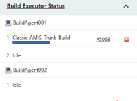
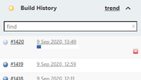
Recently the visual look of Jenkins has changed a bit. It looks nice. However, when it comes to the job progress bars that are visible here and there, they no longer have a visible boundary, so especially if they're on a white background, it is no longer possible to see where the progress bar ends, and thus how far the build has come. This is mildly annoying, so I hope it is possible to make the size of the progress bar a bit more visible.

Here it is somewhat visible, if you're looking real close:

I think this is how they used to look, and apparently still do if you open the build page:

It's much more clear how far the build has come here.
- causes
-
JENKINS-68672 Total length of progress bar still difficult to see in shaded rows
-
- Closed
-
- is duplicated by
-
JENKINS-63677 Progress bar in executors view is no longer useful
-
- Closed
-
-
JENKINS-68439 Ambiguous total length of build progress bar
-
- Closed
-
- links to