-
Bug
-
Resolution: Fixed
-
Minor
-
-
-
2.347, 2.346.1
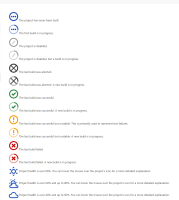
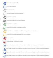
in the icon legend the text is miss aligned for the new "build status" icons however the text is correctly aligned for the weather icons.
e.g. https://ci.jenkins.io/legend
Steps to reproduce
- Install and configure Jenkins 2.332.2
- Visit {{$JENKINS_URL/legend }}.
Expected results
Note: These are the actual results when running with Jenkins 2.328.
- The description of each icon is aligned with the icon in a consistent way.
- That consistent alignment is with the middle of the icon for visual balance.
Actual results
As of Jenkins 2.329, the descriptions of the weather icons remain aligned with the middle of the icon, but the descriptions of the build status icons are aligned with the bottom of the icon. This is inconsistent.
As of Jenkins 2.345, the descriptions of all icons are aligned with the top of the icon. This is consistent, but it creates a visual imbalance.
Evaluation
Bisection shows the original regression was caused by JENKINS-67515 in https://github.com/jenkinsci/jenkins/pull/6162
potential source of second regression (unconfirmed) could be https://github.com/jenkinsci/jenkins/pull/6341
- is caused by
-
JENKINS-67515 Bad vertical icon alignment for M and S icon sizes
-
- Closed
-
- links to

