-
Type:
Bug
-
Resolution: Fixed
-
Priority:
Minor
-
Component/s: buildgraph-view-plugin
-
None
-
Environment:Build Graph View plugin 1.3.1
Jenkins 1.651.2
Latest versions of Firefox and Chrome
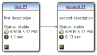
Build descriptions used to be on their own lines near the top of the build node of a build graph (earlier.png).
Version 1.3.1 (or 1.3) of the plugin changed the behavior such that build descriptions are on the same line with the build status information (now.png). This makes graphs vertically more compact, but compromise readability. I liked the old setup better. Please consider reverting back to old behavior unless this was a conscious design decision e.g. to gain more compact graphs.

