-
Improvement
-
Resolution: Unresolved
-
 Minor
Minor
-
None
-
Web
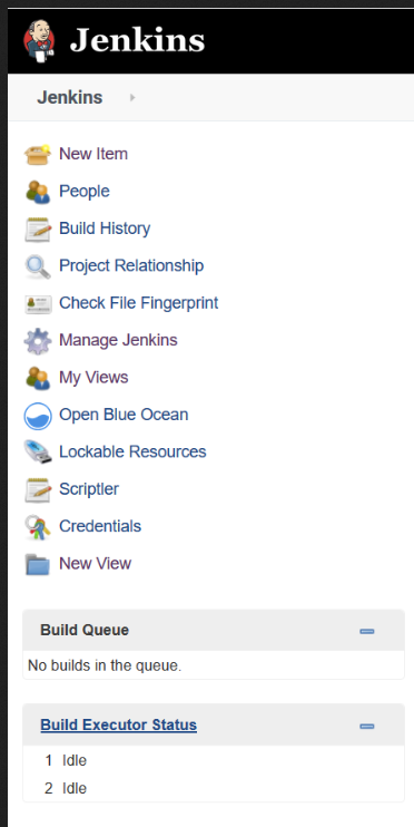
There used to be easily recognizable and catchable, clear entries on Jenkins' main page in the navigation area to the left. Now, for instance, Manage Jenkins (among a few others) disappeared there and lies under the cog wheel at the upper-right, which, BTW, usually stands for Settings, not Manage.
Is this since mankind's brains are degrading successively worldwide and hence pictures are better understood than words?
Why not supply both? Such keeping it easier for one and making it easier for the other group of humans?
Is https://en.wiktionary.org/wiki/if_it_ain%27t_broke,_don%27t_fix_it not a guideline in developing any more?
Agreed, there's more space for Queue and Exceutor Status now. But why not make the navigation (in writing) horizontal if that's an issue? We (almost) all have widescreen monitors nowadays so there's usually plenty of horizontal space and horizontal bars can be (dynamically) multi-line in the opposite case.