-
Type:
Bug
-
Resolution: Fixed
-
Priority:
Major
-
Component/s: next-executions-plugin
-
None
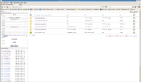
The width of the "next executions" display is not sufficient to show the full name of my Jenkins jobs - see attached screenshot.
I reduced the width of the date field, so that it just shows something like "Mon 16:21", but it did not help at all. If the datetime width is reduced, the jobname width should expand to use it.
Also, I think it would look better if the datetime was on the left, and the jobname on the right.
Thanks
