-
Improvement
-
Resolution: Unresolved
-
 Major
Major
-
any
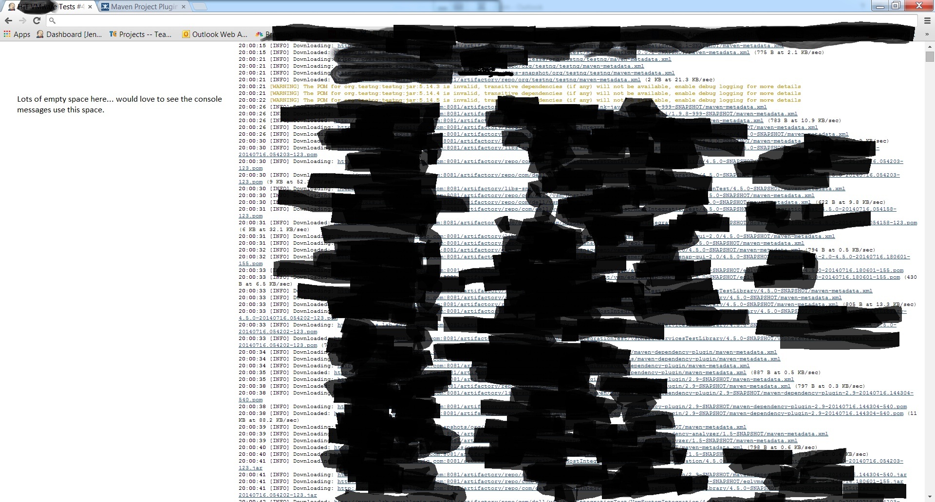
When viewing console output for any build, somewhere between 1/3 - 1/4 of the browser screen is wasted, especially when scrolling down.
Specifically, the menu selections on the upper left side of the screen:
Back To Project
Status
Changes
Console Output
(etc)
— there is a very large amount of space dedicated to these options. And it gets worse: when we scroll down to review more of the console output, the menu options are gone (scrolled away), but the amount of space dedicated to them still remains.
The net effect is that somewhere between 1/3 and 1/4 of the screen (the left hand side) is blank and unused. This looks poor (especially when the menu items aren't even there because we've scrolled down) but is truly a hindrance when trying to review large console outputs.
I'd love to see a 'collapse' icon or any other kind of solution that would allow that menu to collapse to a small icon or relocate to the top center of the window or any other solution that ends up not producing empty blank space.
It seems that in the most recent release (1.572), the behavior changed somewhat, but it doesn't really fix it. It seems that now if we make the browser window narrower, the menu items will jump to the top and stop indenting the entire left portion of the window. But since this only happens when we narrow the window, this doesn't help us view large console output, since we want to make that window wider in the first place..
Please excuse the ugly blackout scribbling on the attachment. But note all the unused space on the left....