-
Type:
Bug
-
Resolution: Done
-
Priority:
 Minor
Minor
-
Component/s: core
-
Environment:Jenkins 1.580.1, viewed on Firefox 32 / Windows
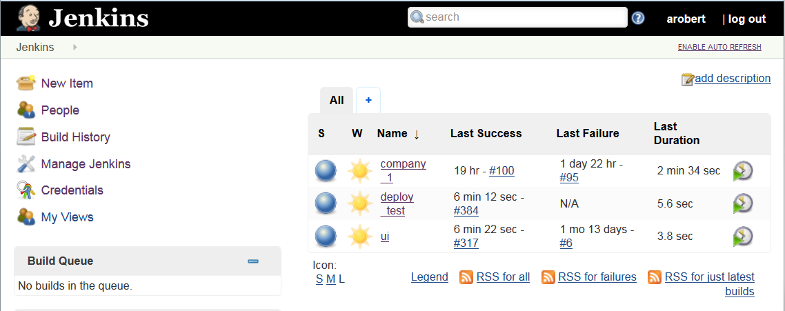
The new UI forces a very wide sidebar on the left, far wider than its content requires when there is content, and still present even when there is none. See the attached screenshots.
In the first one, the actual information the viewer is interested in – the projects and statuses is crowded and line-wrapped over into a little over half of the screen, to accomodate wide blank space in the sidebar.
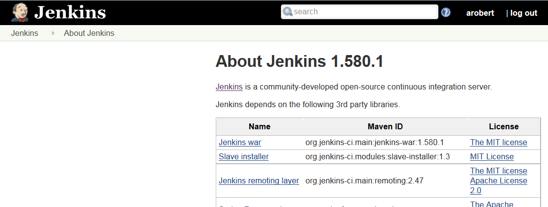
In the second one, the situation is even worse, where there is just a large blank area with nothing at all, crowding the actual content into a narrow column.
Ideally, the left column should be responsive to the content: sizing appropriately to the menubar if it is displaying that, or to zero if there is nothing to show. In addition, there should be a draggable divider so that the user can make it even more narrow (or wide) if they desire.
For me at least, the old UI was more functional and easier on the eyes, so providing the old skin as an option would also be an excellent solution.
- links to

