-
Type:
Bug
-
Resolution: Won't Fix
-
Priority:
 Major
Major
-
Component/s: blueocean-plugin
-
1.0-beta-1, 1.0-b05/b-06, frank
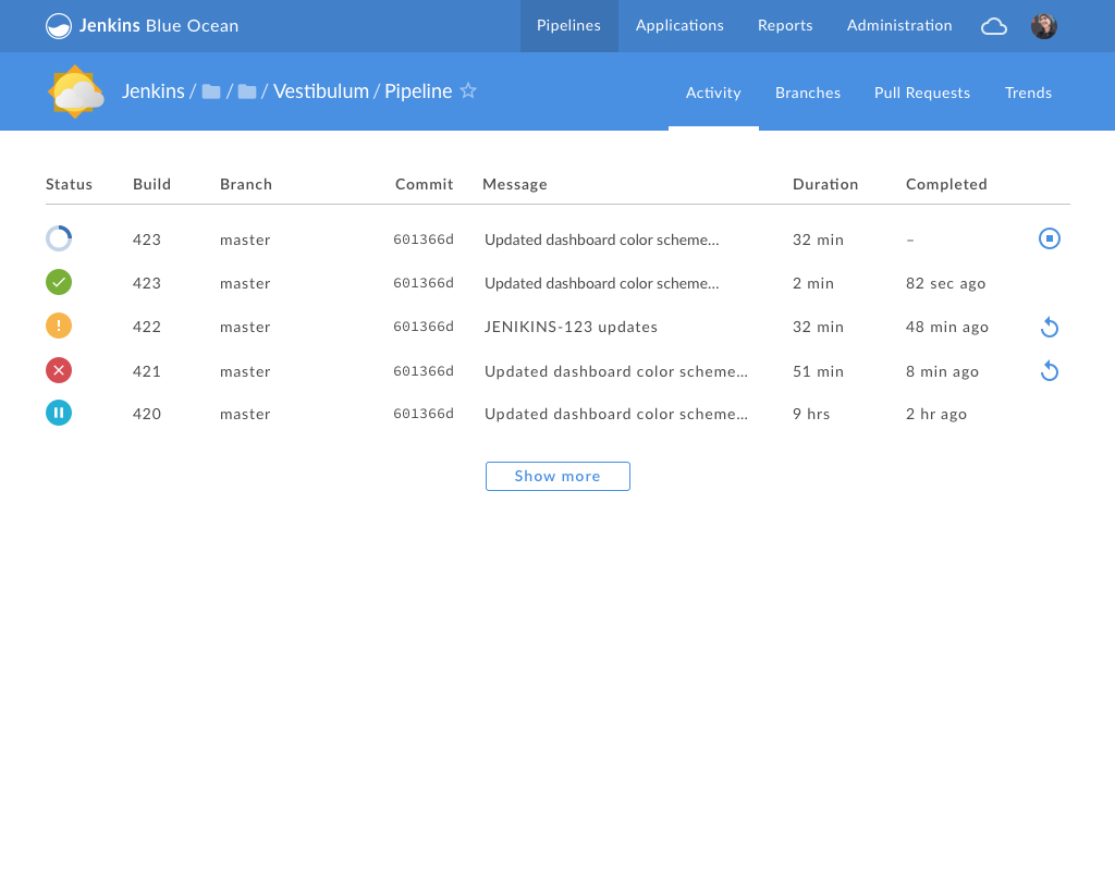
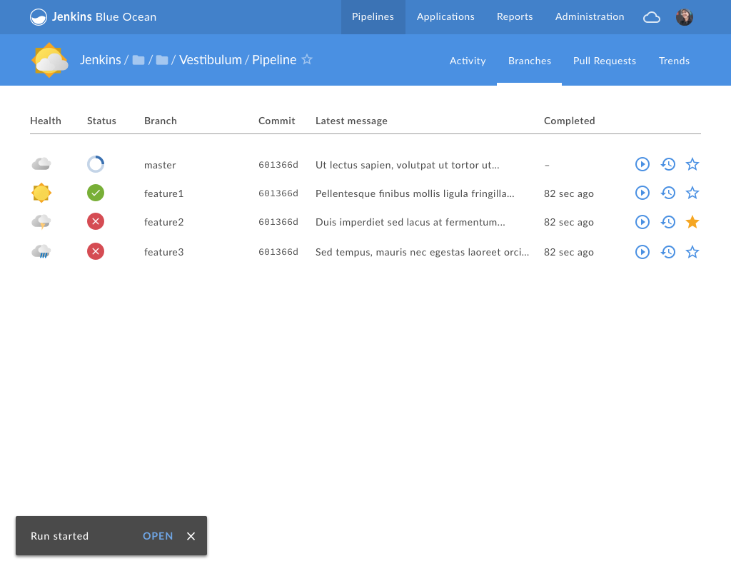
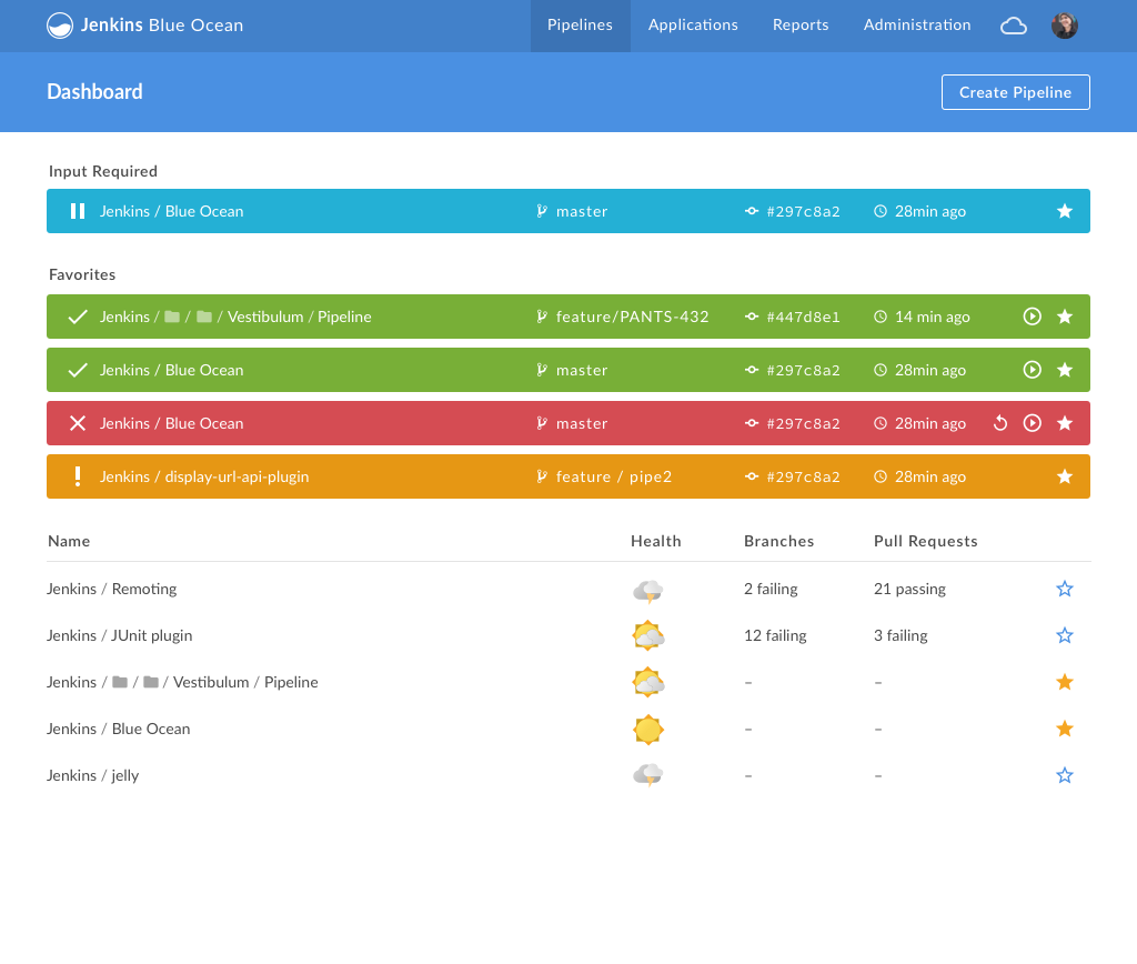
The "action" icons on the right side of various tables are often improperly aligned (should be right-aligned) and have inconsistent spacing between the icons. The columns are often much wider than they need to be.
Areas to look at:
- Pipeline List
- Activity tab listing
- Branches tab listing
- PR's tab listing
Impl Notes
- Some icons are placed directly into the td element within the Dashboard code.
- Other icons (Favorites) are added via an Extensions.Render element
- Both containers need to ultimately have the same height and apply some consistent horizontal spacing between the elements
- Probably requires some small tweaks to Extensions.Render itself (perhaps just adding support for a className prop)
- Column width will be problematic since each is driven by an absolute width set on TH irrespective of the number of child elements. Ideally this should be flexible, although it may require some rejiggering of the table layouts to be more flexible.
- is duplicated by
-
-
- Closed
-
