-
Improvement
-
Resolution: Unresolved
-
Minor
-
None
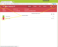
When viewing a build result in blue ocean you have 3 different places where the X is used.
1) top left (to represent a build failure?)
2) top right (to go back to the job / activity page)
3) individual step (to show as failure)
It is very confusing that the one in the top right and top left are visually the same (except font height yet do very different things.
BO should use different renders for different things not use the same thing in different places.
