Uploaded image for project: 'Jenkins'
  1. Jenkins
  2. JENKINS-65850

Accessibility issue - Icon / Symbol Palette colors

    • Icon: Bug Bug
    • Resolution: Unresolved
    • Icon: Minor Minor
    • core
    • N/A

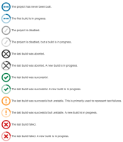
      As identified by cafuego on JENKINS-65124, Jenkins build status symbols suffer from Accessibility issues for those users with color-blindness. Specifically, the new build status symbols introduced in PR # 5065 are not distinguishable for color-blind users.
      (I am not a UI/UX expert and not not have a color-blindness condition; just raising the issue)

      The issue may extend across other features where red/green/yellow is used to distinguish categories (eg: Pipeline Stage View Plugin, plugins using eCharts-API, warnings-ng-plugin, Job Configuration History, Test Results Analyzer and more.

      Recommendation to convert this to its EPIC and separate create issues for known plugins with issues, as done for tables-to-divs issue.

      However, before addressing any specific issues, a review of and a recommendation on "standard colors" and style guide be developed such that plugin developers can reference standardized css class color library with defined colors (eg: class="color-warning"),

      Background information on the color problem can be found here.
      Color blindness: how to design an accessible user interface
      DEFECTIVE COLOR VISION AND TRAFFIC SIGNALS
      Color Blindness & Web Design

      Users who have color-blindness conditions or UI/UX experts may wish to be engaged/provide feedback.

      A recommendation may be to embed information symbols or patterns in an alternate shade as suggested in the traffic lights and as seen in the Mozilla browser compatibility chart.

      Additional information is available from work SonarQube performed on the issue:
      Concerning the usage of colors, Accessibility issues, SONAR-11959: Colorblind-friendly coverage treemaps.

      Unrelated Jenkins instance feedback on color.

          [JENKINS-65850] Accessibility issue - Icon / Symbol Palette colors

          Ian Williams added a comment -

          timja, drulli, cafuego, dduportal, issue created as promised in Jenkins UX SIG - Jun 9, 2021. Added link to minutes.
          cc: tampa

          Ian Williams added a comment - timja , drulli , cafuego , dduportal , issue created as promised in Jenkins UX SIG - Jun 9, 2021. Added link to minutes . cc: tampa

          Ulli Hafner added a comment - - edited

          cafuego I understand that the colors are hard to distinguish. But since the icons use different symbols as well (check mark, cross, etc.) I wonder why this is not sufficient yet. Or do you have a suggestion on what to change?

          Ulli Hafner added a comment - - edited cafuego I understand that the colors are hard to distinguish. But since the icons use different symbols as well (check mark, cross, etc.) I wonder why this is not sufficient yet. Or do you have a suggestion on what to change?

          Ian Williams added a comment - - edited

          I am not sure how accurate it is, but I used the Toptal website Colorblind Web Page Filter to produce the following composite across the four documented color issues.
          It would seem the primary issue for the build-status icons would be similarities in green / red shades used for the check mark and the X as well as similarities in the blue/green shades for ellipses and check mark. Keep in mind, the colors should be distinguishable over each vertical.

          The broader issue would be using consistent color-blind safe tones / images across all Jenkins features like pipelines, charts, etc.

          [ O ] Bildschirmfoto 2021-06-11 um 16.06.23.png
          [ P ] Protanopia - red/green color blindness; anomalous red cones
          [ D ] Deutanopia - red/green color blindness; anomalous green cones
          [ T ] Tritanopia - blue/yellow color blindness; anomalous blue cones
          [ G ] Greyscale/achromatopsia - quick check for all forms of colorblindness


          Ian Williams added a comment - - edited I am not sure how accurate it is, but I used the Toptal website Colorblind Web Page Filter to produce the following composite across the four documented color issues. It would seem the primary issue for the build-status icons would be similarities in green / red shades used for the check mark and the X as well as similarities in the blue/green shades for ellipses and check mark. Keep in mind, the colors should be distinguishable over each vertical. The broader issue would be using consistent color-blind safe tones / images across all Jenkins features like pipelines, charts, etc. [ O ] Bildschirmfoto 2021-06-11 um 16.06.23.png [ P ] Protanopia - red/green color blindness; anomalous red cones [ D ] Deutanopia - red/green color blindness; anomalous green cones [ T ] Tritanopia - blue/yellow color blindness; anomalous blue cones [ G ] Greyscale/achromatopsia - quick check for all forms of colorblindness  

          Alexander Mai added a comment - - edited

          It's even worse for blind people.

          Previous versions had a reasonable "alt" text (e.g. "Successful -> Console") which is gone now.

          Alexander Mai added a comment - - edited It's even worse for blind people. Previous versions had a reasonable "alt" text (e.g. "Successful -> Console") which is gone now.

          Ian Williams added a comment -

          maial, totally agree the of "alt" text should be (required) as universal as possible, certainly for all core features (not sure how that works on something like Blue Ocean UI of charts, etc.).

          This issue was split off from another regarding the visual distinction of the new weather icons.

          I would suggest also creating a separate Issue for "Accessibility issue - Images lacking "alt" text", link to EPIC - JENKINS-62268 Jenkins UI Accessibility, and provide some examples and suggested guidance if necessary. Depending on the scope, a "Recommendation to convert this to its EPIC and separate create issues for known plugins with issues, as done for tables-to-divs issue" may also be advisable.

          Ian Williams added a comment - maial , totally agree the of "alt" text should be (required) as universal as possible, certainly for all core features (not sure how that works on something like Blue Ocean UI of charts, etc.). This issue was split off from another regarding the visual distinction of the new weather icons. I would suggest also creating a separate Issue for " Accessibility issue - Images lacking "alt" text ", link to EPIC - JENKINS-62268 Jenkins UI Accessibility, and provide some examples and suggested guidance if necessary. Depending on the scope, a " Recommendation to convert this to its EPIC and separate create issues for known plugins with issues, as done for tables-to-divs issue " may also be advisable.

          Alexander Mai added a comment -

          ianw Thanks for your advice.

          I've created JENKINS-65923. (see also JENKINS-573 ...)

          Alexander Mai added a comment - ianw Thanks for your advice. I've created JENKINS-65923 . (see also JENKINS-573 ...)

          Frad added a comment -

          thanks a lot for advise! I'll try this

          Frad added a comment - thanks a lot for advise! I'll try this

          Ian Williams added a comment - - edited

          Just came across a Blog post on GitHub in which they describe making colorblind themes available. May be a useful reference.

          Ian Williams added a comment - - edited Just came across a Blog post on GitHub in which they describe making colorblind themes available. May be a useful reference.

            Unassigned Unassigned
            ianw Ian Williams
            Votes:
            1 Vote for this issue
            Watchers:
            5 Start watching this issue

              Created:
              Updated: