-
Improvement
-
Resolution: Unresolved
-
Major
-
None
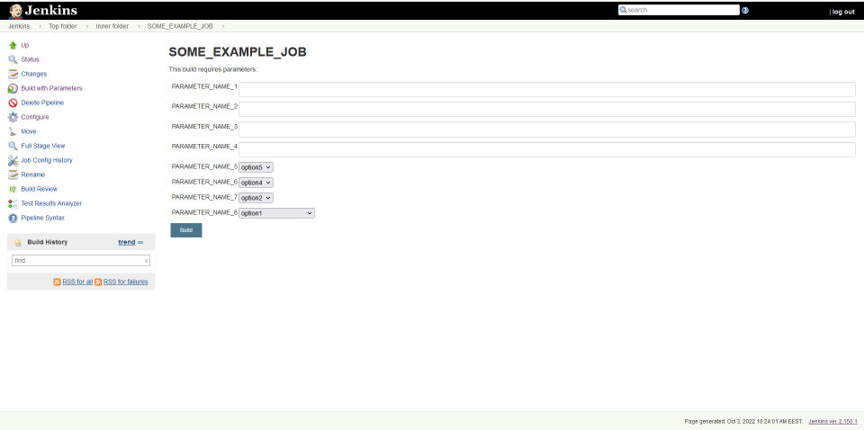
Previously (Jenkins ver. 2.150.1), Jenkins had a denser (compact) view of the "Build with Parameters" form (when configuring a task to run).
It was very convenient for users. The name of the parameter was located to the left of the input field, the description - below the input field.

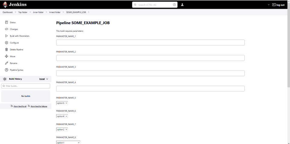
By comparison, the latest version of Jenkins (Jenkins ver. 2.319.2) looks ugly:

These examples doesn't include "description" fields for each parameters.
With them things looks even worse.
UPD. As I understand, following Git commit changed the style of the "Build with Parameters" form:
JENKINS-56109Change Jenkins configuration UI from tables to divs (#…3895)Co-authored-by: Daniel Beck <1831569+daniel-beck@users.noreply.github.com>
Co-authored-by: Tim Jacomb <timjacomb1+github@gmail.com>
Co-authored-by: Félix Queiruga <fqueiruga@cloudbees.com>
Co-authored-by: Tim Jacomb <t.jacomb@kainos.com>
Co-authored-by: Oleg Nenashev <o.v.nenashev@gmail.com>

