-
Type:
Improvement
-
Resolution: Unresolved
-
Priority:
 Minor
Minor
-
Component/s: core
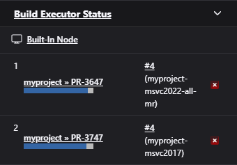
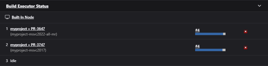
The current executors widget layout contains a lot of unnecessary free space. I just created a short suggestion how it could look after a slightly redesign (the vertical alignment is not perfect, but for a mockup it is enough).
| Desktop view | Small window view | |
|---|---|---|
| Current layout |  |
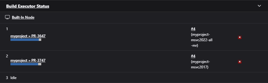 |
| Suggestion | 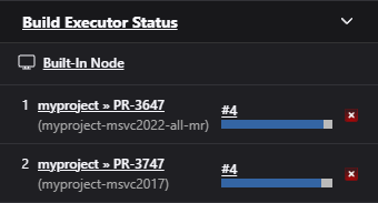 |
 |
Short explanation: The current layout seems to have all columns with a fixed size, except the one with the job name. Therefore the build step name is always wrapped in case it to long. The suggestion moves both to a single cell, so job and build step benefits of more space and not just the job name.