-
Type:
Bug
-
Resolution: Fixed
-
Priority:
 Minor
Minor
-
Component/s: core, gerrit-trigger-plugin
-
Environment:Jenkins 2.423
gerrit-trigger 2.39.3
-
2.463
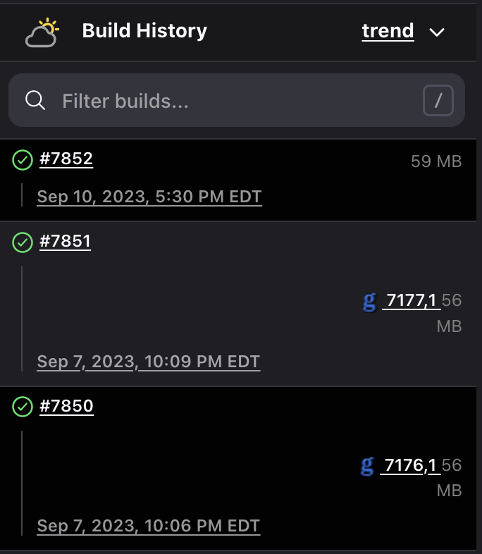
In the attached screenshot you can see the difference between build #7852 (manually started) and two other builds triggered by gerrit. Although the first one isn't perfect either, the latter two look considerably uglier, with the odd positioning of the gerrit change number ("7177,1"), lots of wasted space, and the line break in the middle of "56 MB".
Two other (minor) visual issues are:
- the overuse of underlined text, which (IMHO) adversely affects legibility and is inconsistent with the rest of the Jenkins UI;
- both the build# and the timestamp link to the same page, which seems redundant.

