-
Type:
Bug
-
Resolution: Fixed
-
Priority:
 Critical
-
Component/s: matrix-project-plugin
-
Environment:RHEL 9
Java 11
Hi,
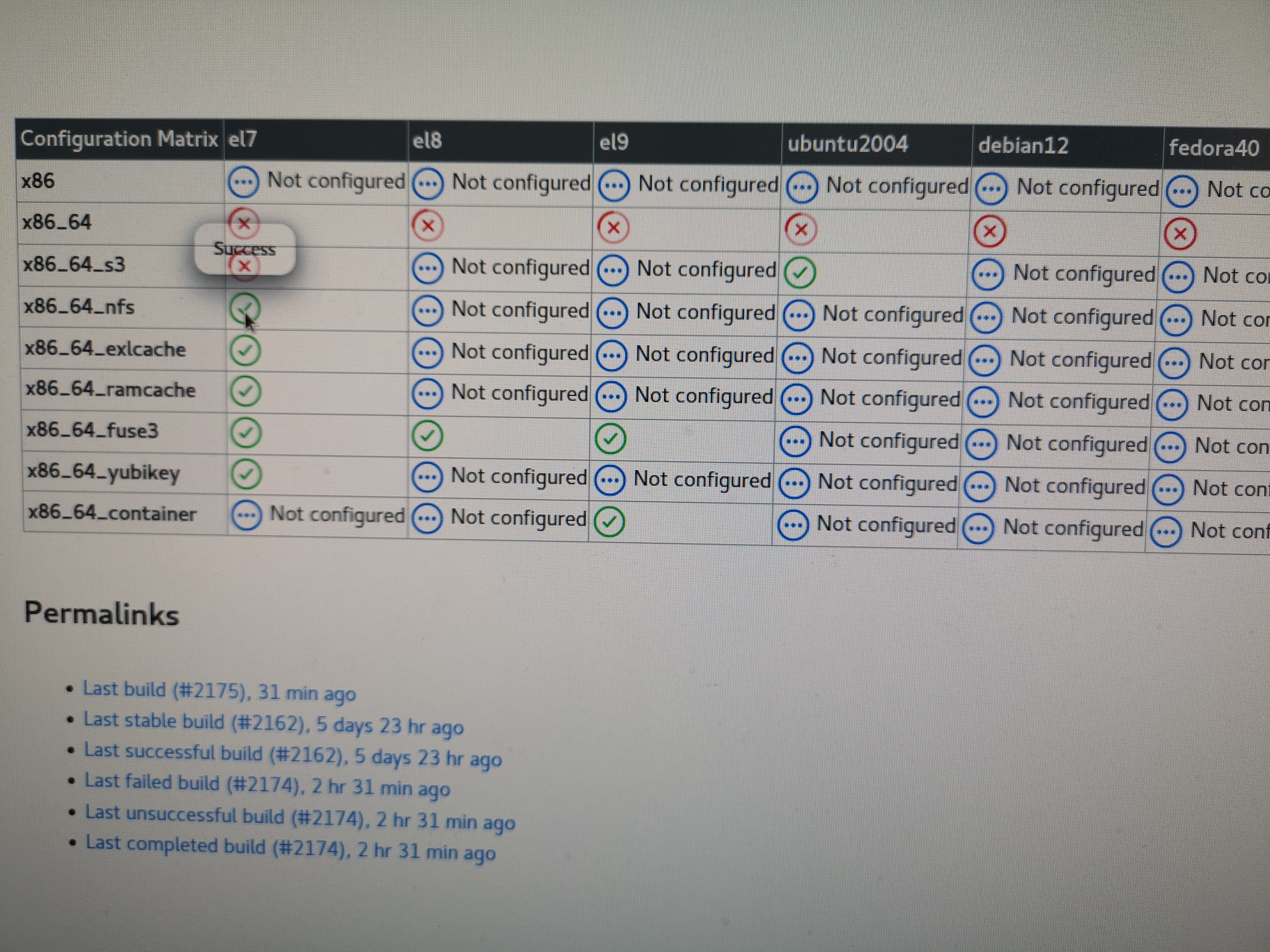
After updating Jenkins to version 2.254.1 and matrix project plugin version 830.v7ea_da_561b_a_34, the job build hyperlinks are not working . When I move the mouse to the link then it shows the status of the build and does not allow to click on it to go to the build. See the attached pic.
Is it a known issue? Is there any work around?
Thanks,
--Shahzad