-
Type:
New Feature
-
Resolution: Fixed
-
Priority:
 Minor
Minor
-
Component/s: active-choices-plugin
-
Environment:Jenkins: 2.479.3
OS: Linux - 6.1.134-150.224.amzn2023.aarch64
Java: 17.0.15 - Amazon.com Inc. (OpenJDK 64-Bit Server VM)
uno-choice:2.8.6
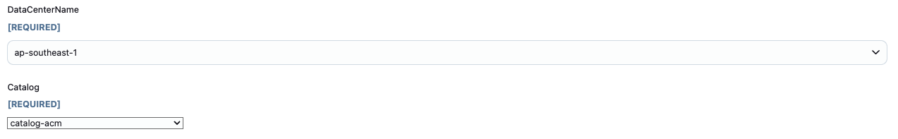
In Jenkins job configuration:
- A Choice Parameter appears as a standard dropdown <select> element — clean and consistent.
- An Active Choices Parameter with "Choice Type" = Single Select" renders differently. It's either:
-
- Rendered with a different style (height, font, padding),
-
- Or not visually consistent across browsers.
This inconsistency causes a less unified user experience and may confuse users, especially when both types are presented together in a single form (see attached screenshot).
The Active Choices (Single Select) should visually match the native Choice Parameter dropdown — both using a native HTML <select> box with consistent style.
Is it posible to make a UI of active choices parameter to the same with Jenkins native choice parameter?
- duplicates
-
JENKINS-72282 [Active Choices] HTML Input elements miss Jenkins CSS classes
-
- Fixed but Unreleased
-
- links to

