-
Type:
Improvement
-
Resolution: Duplicate
-
Priority:
Trivial
-
Component/s: pipeline-stage-view-plugin
-
None
-
Environment:Jenkins 2.249.1 LTS running on Ubuntu 18.04LTS VM on Google Cloud. 1 master node 4 CPU 32GB RAM, 2 agents 16 CPU 64GB RAM.
We just upgraded to Jenkins 2.249.1 from 2.190.3.
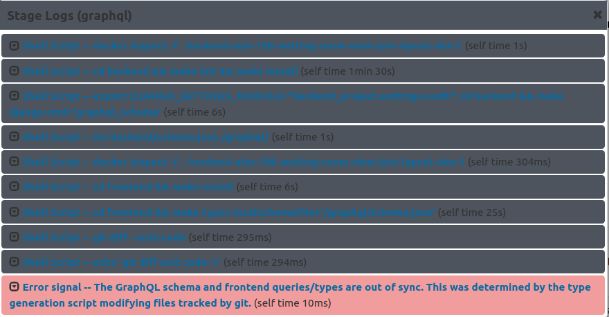
Some of our users are complaining that the stage log headings are too dark. I tend to agree, and the blue font is really hard to read on top of the dark gray.
This is not critical, and I love Jenkins a lot, so I hate to complain. But it would be nice for the default theme to be easier to read in this regard.
If I try the Dark or Solarized themes this improves. This is only a problem with the default theme. Some users prefer the default theme.

- is caused by
-
JENKINS-63556 Pipeline stage view text contrast very low in 2.249.1-rc
-
- Closed
-