-
Type:
Bug
-
Resolution: Fixed
-
Priority:
Minor
-
Component/s: bootstrap5-api-plugin, data-tables-api-plugin, echarts-api-plugin
-
Environment:ECharts API Plugin 5.2.2-1, Warnings Next Generation 9.8.0
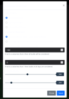
Clicking the Setup button on a warnings-ng chart with the dark theme activated results in a white dialog with light colored text that is difficult to read. See attached screenshot.
The text can be selected to make it legible to workaround this issue.
- is duplicated by
-
JENKINS-68677 Compatibility to dark theme plugin
-
- Closed
-
- links to
