-
Type:
Bug
-
Resolution: Fixed
-
Priority:
 Minor
Minor
-
Component/s: core, metrics-plugin
-
Environment:ci.jenkins.io -> 2.332.3
chrome 101.xxx
-
4.1.6-383.v9d1dd57200e0
NB: files against core - may be a theme plugin but this is installed and is the default view on ci.jenkins.io, not sure where the code is.
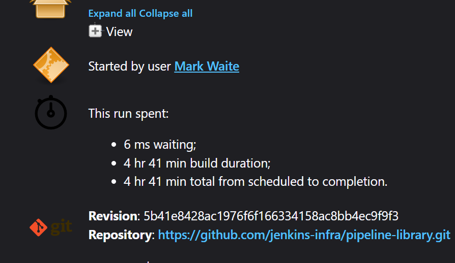
when looking a at a pipeline build the icon for its "timings" in the sidebar and the main page has too low contrast in dark mode and is not really readable.
Steps to reproduce
- in chrome open visit https://ci.jenkins.io/
- login
- visit https://ci.jenkins.io/me/configure and select "Dark" as the theme (note the default for anonymous users is Dark respect OS - so if you are just a regular joe blogs and use a dark mode in OS you will get this by default)
- visit https://ci.jenkins.io/job/Core/job/jenkins/job/master/lastStableBuild/
- locate the timings icon in the main panel and the sidebar
Expected Results
The timings icon has sufficient contrast that the icon is clearly legible
Actual Results
The icon is barely legible (see attachment)