-
Type:
Improvement
-
Resolution: Unresolved
-
Priority:
 Minor
Minor
-
Component/s: core
####Feel free to move or alter as needed, no idea what you want this sorted under.
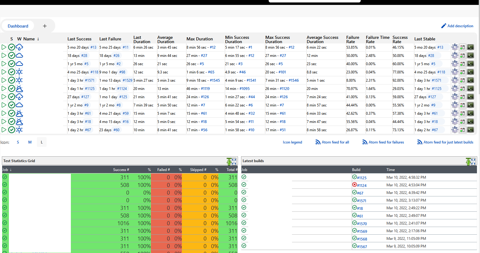
Just upgraded to the latest release and my goodness, beyond not using a dark theme and now being even more blind than usual, the amount of wasted space has gotten so bad now the handful of projects I have don't even fit into the main view anymore.
I'm all for cleaning things up, making them less prone to fat-fingering things you didn't mean to click on, but adding padding and margin to everything to a point I cannot get a good overview over things is just bad design.
I attached an image as what it looks like vs. what it should look like, below is the code I added as override in Stylish.
.jenkins-table {
	border-collapse: collapse;
	--table-padding: 0.0rem;
     margin: 0px;
}
.jenkins-table__cell--tight {
	padding-left: 0 !important;
	text-align: center !important;
	white-space: nowrap;
	width: 0px;
}
#main-panel {
	padding: 0rem;
	display: inline-block;
	width: 100%;
}
.tabBar {
	display: inline-flex;
	align-items: center;
	flex-wrap: wrap;
	background: #f2f2f2;
	background: var(--tabs-background);
	border-radius: calc((10px + 34px) / 2);
	border-radius: var(--tabs-border-radius);
	padding: 2.5px;
	margin-bottom: 0rem;
}
.jenkins-table > tbody > tr > td {
	vertical-align: middle;
	padding: var(--table-padding) 0 var(--table-padding) var(--table-padding);
	font-weight: 500;
	height: 0px;
}
.jenkins-icon-size {
	display: flex;
	align-items: center;
	justify-content: space-between;
	margin: 0rem 0;
}
This removes most of the margins and padding from the existing rules to regain some compact overview. It's a bit overly aggressive I admit and can probably be done with just a few pixels of padding and margin here and there, but having at least 8 or so projects in overview when you open jenkins is quite useful and as is evident from the screenshot, when tightly packing the columns with or without padding they don't become any less difficult to read anyways. Moving margin from 2rem to like 0.2rem perhaps and adding more clear table cell borders. Just spacing things doesn't make them any clearer to read.

